

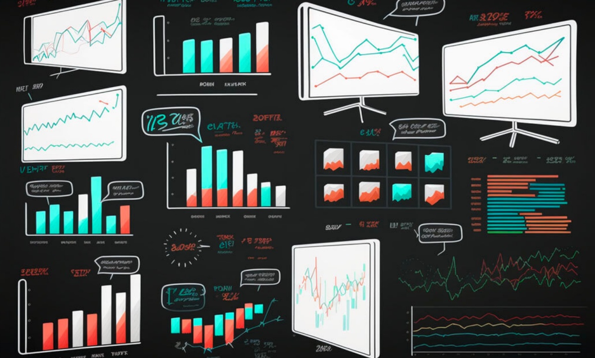


The most commonly used charts are line, bar, and candlestick charts. Each one has its own strengths and weaknesses in analysis.
Stock market charts can change the way you analyze your investments. They are visualizations of the price of a stock over a specific amount of time and can be an essential tool for analyzing stock price movements, identifying trends, and making informed investment decisions.
They allow you to see the bigger picture and identify patterns that can provide valuable insights into your portfolio’s future performance, but for a beginner, they can be daunting. If you’re looking to use them but don’t know where to start, don’t worry. We are here to help you understand the basics of stock market charts so you can utilize them in your investment decision-making.
Types of Stock Market Charts
Different types of charts are used to visualize stock prices in various ways. The most commonly used charts are line, bar, and candlestick charts. Each one has its own strengths and weaknesses in analysis, so let’s take a closer look at what they’re used for.
Line Charts
The line chart is the most simple and easy to understand. Each point on the chart represents the closing price of a stock for that day, week, or month. The line connects all the dots and gives you a visual of the general fluctuation, but it won’t tell you detailed information about the activity of individual days.
Investors and traders use line charts to track changes, identify trends, and predict a stock’s price movement. Due to their simplicity, they are an excellent resource of data for beginners. However, they are not suitable for more in-depth analysis, like intraday price movements.
Bar Charts
Bar charts display a stock's price movement by using vertical bars. The top of the bar represents the stock's highest price during the selected time period, while the bottom represents the lowest price. The opening price is indicated by a short horizontal line on the left side of the bar, while the closing price is a line on the right side of the bar.
Colors are also used in bar charts to make price movement easier to follow. If the closing price is above the opening price, the bar is often green or black, and if the closing price drops below the opening price, the bar is typically red. Bar charts provide more information than line charts and are used for identifying trends and reversals, monitoring movement and volatility, and analyzing trading volume.
Candlestick Charts
Reading candlestick charts is similar to bar charts as they show much of the same information but in a more detailed way. Like the bars, the top of each candlestick represents the stock's highest price during that time, while the bottom represents the lowest price. The vertical lines above and below the body of the candlesticks are called shadows or wicks. They demonstrate the highest and lowest price that stock traded at during that time.
The color of the body of the candlestick tells you information too. If the closing price is higher than the opening price, the candlestick is usually colored green or white. If the closing price is lower than the opening price, the candlestick is typically red or black. Since candlestick charts provide high, low, open, and close price points, they are favored by advanced traders and investors. They use them to identify patterns, such as bullish and bearish engulfing patterns, and determine trading decisions.
Reading Stock Market Charts
Reading stock market charts as a beginner can be a challenge, but with practice, it becomes easier. Start by selecting the type of chart you’re comfortable with and pay attention to the time period of that chart. Next, look for trends in the stock's price movement. If a stock's price is moving higher over time, it’s on an uptrend; if it’s moving lower, it’s on a downtrend. Sometimes it will move sideways when the supply and demand of a stock is close to equal.
Another facet of reading a stock market chart is technical indicators, which are mathematical calculations based on a stock's price and volume data. They can help you verify trends, see potential trading opportunities, and mitigate risk.
Technical indicators are displayed on the same chart as the stock's price. There are many different types, such as moving averages and relative strength index (RSI). The moving average is one of the most commonly used technical indicators. It’s a single line that shows the short-term and long-term average in order to predict the security’s future movement. The RSI is another popular one. It measures the speed and fluctuation of a price movement over a specified time. It oscillates between 0 to 100 and is typically displayed as a line chart below the main price chart.
Analyzing Stock Market Charts
Once you learn how to read a stock market chart, you can begin to understand how to analyze them to gain insight into individual stocks and the overall market. You can do this by comparing stocks, identifying support and resistance levels, and using chart patterns.
When contrasting stocks using charts, you should start by selecting a group of similar stocks in the same industry or sector. You want to compare apples to apples and not oranges. That will give you a more accurate picture of your security’s value and potential for growth.
To identify support and resistance levels, you’ll simply need to look at the chart for areas where the stock’s price has reversed direction in the past. The support level is where it has come back up after a decline, while the resistance level is where the stock's price has stopped rising and fallen back down. They are used to predict where a price might start to rise or fall again.
Another analysis tool is chart patterns which are formations created by a stock's price movements over time. There are many formations that can develop, such as a pennant, flag, or ascending triangle. They all represent various trends with different potential outcomes and can be useful tools in predicting future price movements.
Common Mistakes When Interpreting Stock Market Charts
Interpreting stock market charts can be a bit overwhelming at first, and making mistakes is easy. You want to avoid a few things if you’re a beginner.
First, don’t rely on a single technical indicator. Technical indicators should be used as resources to support an investment decision rather than the sole determining factor. Always use a combination of analysis techniques to reach your final conclusion.
Another mistake that beginners make is misinterpreting chart patterns. Chart patterns can be complex, and it’s not uncommon to get them mixed up or overlook other factors that may affect the stock's price movement. Don’t make any investment decisions based on chart patterns until you learn about them in-depth and have a solid understanding.
Putting it into Practice
Once you know how to read and understand the various charts, you can find insightful trends and patterns that indicate buying and selling opportunities. For example, there are dozens of bear and bull patterns that indicate continuation and reversal. Being able to identify these and move on them can prove invaluable.
Also, suppose a specific index or fund is showing a trend in one of the charts. In that case, you can dive deeper by looking at the individual securities that make it up and analyzing which ones have entry opportunities. This could be a great place to start when looking for a new company to get into.
The same is true of resistance. Chart analysis can indicate when not to enter a specific holding. If you see a bearish pattern forming, it may be best to hold off until you see a more favorable position.
Stock Market Charts Are One Piece of the Puzzle

Stock market charts can be an excellent tool for identifying trends, support, and resistance levels and predicting the path of your security’s movement. They can help you make informed investment decisions. However, it's important to note they should only be a part of your decision-making process and not the sole basis. Always do your research and incorporate other factors when making choices about your finances.
